End-to-End
Inventory IQ
An end-to-end app designed to aid people keep an inventory of their property for insurance, divorce, tax, etc. purposes.
Introduction
Through social media, I learned that a number of avid readers record what books they have and for how much, should they incur a loss through a fire, etc. This could potentially be taken into other areas of ownership — business owners and their assets or personal properties.
Problem
It’s difficult to estimate an accurate value of personal (or business) property during moments of high stress, or when another party becomes involved
Solution
When it comes to assessing the value of belongings for insurance, divorce, tax, or personal reasons, Inventory IQ removes the stress and panic when it comes to what belongs where or to who, and it’s value. When the user needs to know the total value of something (i.e., when dealing with insurance), they have that information right at their fingertips.
Project Duration
Tools
26 Days
Figma
Role
Team
UX Designer
Solo
Inventory IQ
Removing the Mundane
Having the bright bold colours helps create a boring mundane task fun. It’s similar to being a student again with colourful folders for each subject.
If the another unit of an item has been obtained, go into the item and change the units easily. The item will move to the top as being the most recent edited item making it easy to view list in chronological order
Edit within the Bucket
Create your own Bucket
The bucket can be organized in any which way, with by Room being the easiest way. Adding a colour to each bucket helps to quickly associate what item belongs to what bucket in the All Items screen.
Research
Interviews
Learn how people go about tracking their personal inventory
How people would preference to categorize and organize their personal inventories
If users had a time in their life where they needed the value or number of their assets for insurance dealings, divorce, taxes, etc.
Five Participants
3 male, 2 females
25 - 54 years old
remote
“The last time I had to deal with insurance was regarding my vehicle. From what I recall, they tooks months to settle my claim when it shouldn’t have taken more than a couple weeks.”
“I would cateogrize my buckets as price. I see the benefit of room and funtion, but should something happen, I want to know what items are the most valuable.”
“I recently just moved, and if I had kept an inventory, it would’ve defenitly helped with tracking my belongings.”
“As a business owner, having an inventory is vital to track my business assets, and catch losses or thefts. It’s likely I’d have to deal with insurance or those I have on my team when it comes to these things.”
“I feel like keeping an inventory is a good practice. It means folks can have a better idea on what they have of value, and could use this data to help protect themselves.”
Learning Objectives
Majority of the softwares in the market have a target demographic that consists of businesses, with individual usage being an add on. While some of them are part of packages (i.e., Sharepoint with Microsoft), others are individual inventory softwares.
The gap that I was provided the opportunity to fill was to remove the mundane out of the task, and allow the user to have more control over what and how is recorded when adding an item.
Market Research
Define
Feature Set
Add an item
A button with a plus that allows the user to add a new item into their inventory
Would take user to a screen where they would fill out the fields about the item
Option to take a picture of the item for easy future reference
Take a picture
A button which navigates the user to their phone camera
The picture will take the user to similar items which they select and then can autofill the fields of the new item being added (think Google Image search)
Access Buckets
A button which takes the user to all their lists/buckets
Button will either have a folder with tabs or a bucket
Categorize
User can add more categories within the bucket to make it easier to differentiate the inventory
Option to do so would be when user is adding item
Task Flow
Edit
3 dots on the very right of the item
Drop down provides user with options to Edit, Delete, Move
Profiles
Option for user to view who else has access to the inventory
One admin will control who gets access to what bucket (or open access)
Share
User can email, text (or print) their inventory
On top of the buckets page, there will be the 3 dots which provides the user with the option
The task flow a returning user would take to add a new item to their bedroom bucket. It present one of the flows the user may take as if they would want to first view the specific bucket first. The user could also add the item directly from the homepage and then select the bucket from there.
Site Map
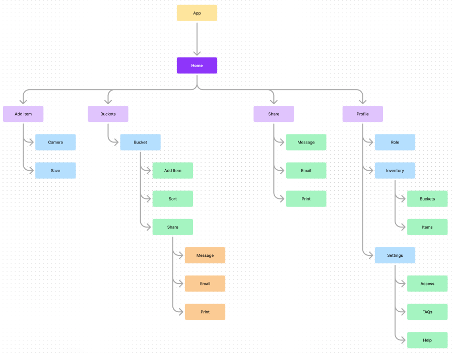
The site map was designed in a away where all of the main navigation was present on the landing page. From there, it would be dependent on what the user is trying to navigate.
The homepage mainly has the Bucket and the ability to add an item.
Design
Branding
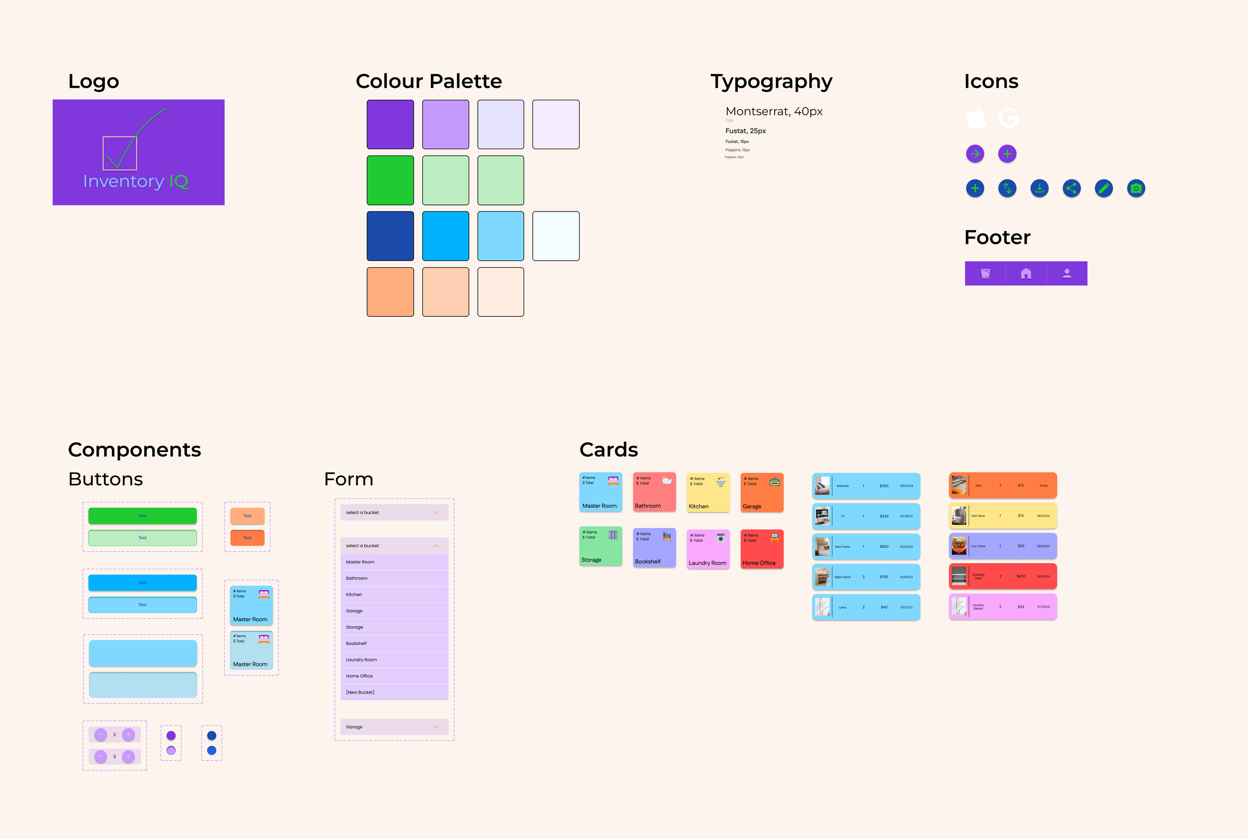
The primary colours represent the ideal path for the user
The variety of colours is meant to remove how mundane one would consider keeping an inventory
Low-Fidelity Wireframes
I had primarily gone in direction where the interface contained a lot of square edges, however it didn’t look right. Playing with the creating round curves - bubbles - the interface began taking a more fun and inviting route. This low-fi shows the fun and simple interface that the app will take, making it inviting for the user.
Testing & Iterations
Completing the screens, were followed by testing which provided a few iterations to help enhance the user friendliness of the app and reduce the likelihood of pain points.
The Add New Item screen before asked for the bare minimum. This turned out to be a possible pain point as there may be a point when the user would like to view how much they paid for each item or where they made the purchase from.
The camera icon was also changed and users thought the camera with a magnifying glass meant that taking a picture would take them to the shopping page on Google.
BeforeAfterHigh-Fi Mockup
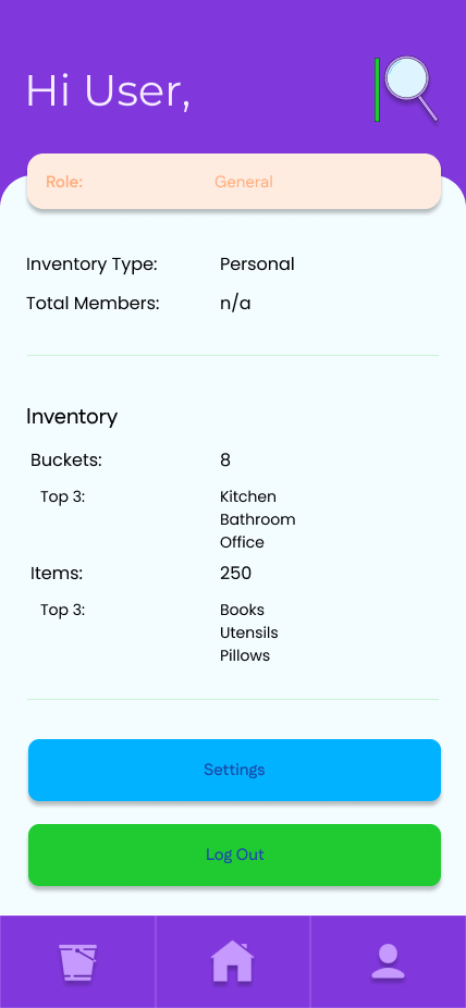
use the arrows to go through the screens!BeforeAfterThe User Profile carried a lot of information prior to iterations - the inventory especially. The usability test presented that the users didn’t care for their Top 3’s, but instead would prefer to see the total amount of their assets and their most valuable buckets.
BeforeAfterUsers noted that the logo made no sense to them. After being informed the magnifying glass if a “Q”, they shared that it wasn’t an obvious correlation. This led to simplifying the logo.
BeforeAfterChanged the share button to the universal Share button.
UI Kit
Conclusion
Usability Testing
During the test, users were asked to complete tasks, and each was followed by a series of questions.
The usability test presented that users wanted simplicity, but enjoyed the upgrade from tracking inventory to being less plain and boring.
The flow made sense, but users wanted more data input (i.e., store the item was brought from)
Users wanted to see the total value of all buckets, which was added to the User Profile.
Challenges
“I like that I’m able to control how the inventory works for me. It’s customizable, and straightforward.”
Expected users who owned a business to want more features to help with their business needs, but instead found that they wanted something simple → manipulate it on their own accord
Didn’t expect users to prefer to manually input data when adding an item instead of automatic inputs (i.e., similar to a reverse Google Image search)
Solution: I rearranged my list of priorities. i listened to what the responses were saying, and noted how I could best integrate them in. What would they replace? How would they be presented?


