Responsive Web Design
Unicus General Contracting
A Calgary based POC owned contracting company that specializes in commercial contracting.
Introduction
Unicus is a small contracting business which is slowly making waves within the world of construction. The company is a few years old, and is now introducing personal property services - roofing and siding. They have a strong relationship with their clients, with them returning with more projects at hand. Unicus has built a strong reputations, exercising transparency and commitment to high quality.
Problem
How can Unicus General Contracting present their previous projects to their potential clients in a compelling way?
How can the services offered be designed to make it easy for the user to understand what the service entails?
Solution
Based on the user interviews conducted, it showed that it was important to design the responsive interface in a way where what each service meant was obvious, receiving a quote was a simple process, and the company’s commitment to transparency and results is adamant.
Project Duration
Tools
17 Days
Figma
Role
Team
Lead UX Designer
Solo
The Product
Choose Your Own Adventure
User has the opportunity to decide how they’d like to explore the site, accommodating the user’s experience level within this type of service industry.
Easy Navigations
Holding the user’s hand to ensure they know exactly what something means allows for a pleasant and easy user experience. This is likely to help compel the user to submit the contact for.
Research
Learning Objectives
What are users seeking when finding a contractor?
How previous projects play a role in helping the user decide whether they want to go with that contractor
How the user prefers the contractor interacts and updates the user
Interviews
Five Participants
2 male, 3 females
25 - 54 years old
remote
“Online presence matters. A company is creating their first impression through their website or social media. If it’s not up to date and doesn’t show what you’ve done, why would I hire you?”
“I’m really picky with who I hire when it comes to getting work done. Google is a great way to weed through the reviews and really see what it is that I could be getting.”
“A company shouldn’t be based entirely on their reputation. There’s some companies that have been in the industry for a while but don’t deliver quality work. While some new one’s are delivering high quality work.”
“There should definitly be some type of warranty-type deal provided by the company after providing the service.”
“I’m someone who seeks out consultations before I sign any contract to know whether or not this is a professional I can not only get along with, but are able to help execute my vision.”
Low-Fi Wireframes
In order to design the site in a way where the user is able to navigate in a way where they’re compelled to contact the company, it was important to add cards for the services and project screens to allow for the user to get a hint of what the service and project entailed prior to selecting it.
Homepage has a pop-up to help user decide on the journey they’d like to take
Services page has cards which will have an image to present the user with a visual of what the service will entail
Projects page will mirror Services to avoid jarring users
Project page will provide a blurb of the goals and business that hired Unicus, followed by what services Unicus provided, images of the site, and a CTA
Testing & Iterations
Testing & Iterations
Completing the screens, were followed by testing which provided one iteration that was primarily pointed out by the usability test: the navigation
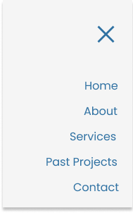
“Past Projects” confused the users and expressed that they’d prefer if it only said “Projects”
BeforeAfterHaving the Services Included as a button made more sense versus having them on the same page as a list. This allows for the user to view the services should they choose to, given the pictures of the project they’re viewing relate to their vision.
BeforeAfterHigh-Fi Wireframes
Use the arrows to go through all the screensConclusion
Usability Testing
Users expressed the screen were easy to navigate through, and the purpose of all of the features and choices (i.e., cards) were clear as they were having the desired affect. The users were able to identify what each card meant or where it would take them based on the visual provided.
The screens were attractive, and encouraged the users to want to scroll and interact. The up-to-date site helps convince the user that the business has a high quality reputation.
Challenges
“I don’t have any experience with hiring help for construction, but [the cards] helps me determine what service means what.
One of the biggest challenges I faced was organizing the project page in a way where it would compel the user to want to contact Unicus. According to the owner, the goal is to at the very least have a conversation so the potential client has a face to the business.
Solution: Organizing the content according the business type, services, images, and CTA was determined to work the best. This is because it allows the user to recognize that there is no limitation as to the type of business Unicus is able to provide their services too. From there, going into details on the type of services so the user has an understanding of how much is involved in bringing their vision to life.


